Introduction
The purpose of the Quality Assurance and Quality Control (QAQC) is to ensure the quality of data and information used to make decisions on project value and project progression are sound. The quality of mining and project decisions is fundamentally contingent on data quality.
In this section, we discuss the use of statistical tools to monitor sample quality.
A positive QAQC is the database’s stamp of approval. Without this stamp, all the effort on complex geological interpretations, mathematical estimations and resource classification is called into question. Poor QAQC practice is equivalent to generating a resource blindfolded.
When do we put effort into QAQC? Well, it is a process that should be analysed as data is collected. QAQC should accompany every parcel of data. QAQC is most effective if used during a drilling campaign to MONITOR data collection and call a halt to a campaign or laboratory that is underperforming. Running a QAQC at the end of the data collection program is an ineffective way to manage data collection.
A good QAQC process is one that is active, ongoing and reviewed as data is collected; it is easy to understand, makes sense and gives you sufficient information to take timely corrective action on your rig, with your sampling procedure or at the laboratory.
Let us look at ways to analyse data quality.
Statistical process control
Process control is the act of checking the quality of a process. In simplest terms, we take a value we know (standards and blanks) and insert them into the assaying process. We then plot the assay values returned by the laboratory for these known values and evaluate how close they are to the actual value. Some variation is expected, however, we want to ensure the returned value as well as the variability of the returned values is reasonable.
Run charts
Run charts are simply a plot of values measured over time. The value measured is plotted on the y-axis. These values are plotted against time on the x-axis.
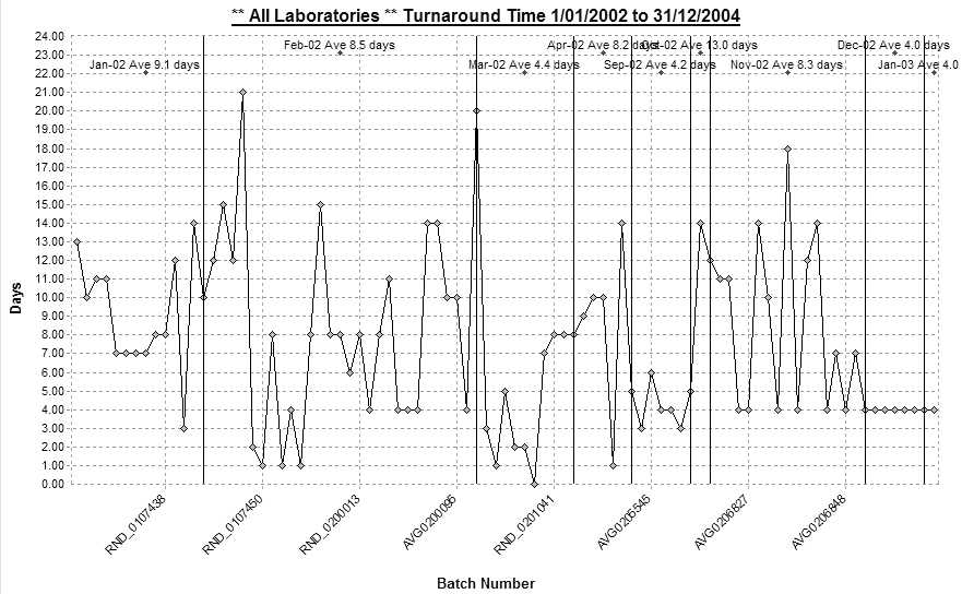
Run charts are useful for tracking trends. For example, a run chart on turnaround time at the laboratory may indicate a trend of increasing turnaround time (Figure 1). In particular, run charts are useful for spotting non-random patterns (Figure 2).
Control charts
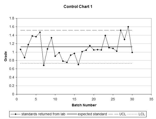
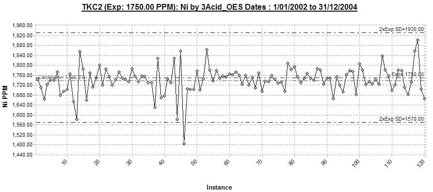
Control charts are run charts with control limits. Control limits provide a sense of when to start worrying about a process or when the process is out of control. The control limits are predefined (expected standard grade and variability).
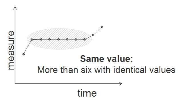
In Figure 3 instance 46 is out of the control limits. Notice the erratic values that precede instance 46 and the sudden run of three almost identical values …. mmmmm makes me wonder?!
A plot with all the standards and blanks on a single graph helps identify consistent patterns in the batches (Figure 4).
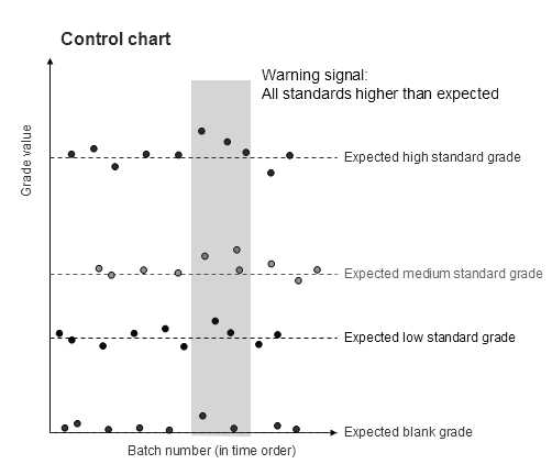
Another useful grade to plot on the control chart is the grade of the sample just prior to the standard grade analysed as well as the grade returned for the standard sample. This is useful for checking for sample smearing in the laboratory assaying procedure.
Looking for patterns
Bias
Typically, we look out for a consistent bias or patterns in the control charts. This is revealed when the laboratory delivers sample values for the standards that are consistently high or low. However, how many consistently high (or low) samples do we need to be confident that there is a problem?
If the laboratory is producing random high and low grades around the standard, we will expect to see this plotted as a sample value either above or below the expected grade.
Consider what a random variability around the standard value should look like. For one, it should look random. But how do we know when a pattern is random or not? The simplest and best-known random process is flipping a coin. Flip a coin and you have an even chance of either a head or a tail.
Let us simulate the probability of getting random high grades back from the laboratory. In flipping a coin, we will record a head as a grade above the expected standard value and a tail as a grade below the expected standard value.
If we submit only one standard sample we will see either the grade as either above or below the expected standard grade. There is thus a 50% chance the standard value is higher than the expected value.
Now, if we submit two standards we are essentially flipping two coins. The two resulting standard values are one of head-head, head-tail, tail-head or tail-tail. Therefore, there is a
25% (one in four) probability that the two consistently high standard values delivered by the laboratory are due to random errors.
Consider three standard values. The random patterns are associated with the flipped coin are :
HHH, HHT, HTH, HTT, THH, THT, TTH, TTT
So there is a one in eight (or 12.5%) probability that three consecutive higher than expected standard values is due to random noise. Three consecutive high values do not tell us enough about the presence of a bias in the laboratory.
But what about four consecutive high values? How random is this? The probability of four consistently high grades is one in 16 (or one out of 2 x 2 x 2 x 2), which is a 6.25% probability that four consecutive high values is random.
And five consecutive high grades? … one in 32 or 3.125% probability.
And just for good measure, the probability of six consecutive high grades is one in 64 or 1.5625% probability.
Similarly, there is a one in 128 (or less than 1% probability) that there will be seven consecutive high grades.
A good dose of common sense is invaluable when interpreting control charts of standards and blanks. We expect the laboratory to have a degree of error in the standards we submit. We do not want to see consistent bias in our data (either above or below the expected standard grades).
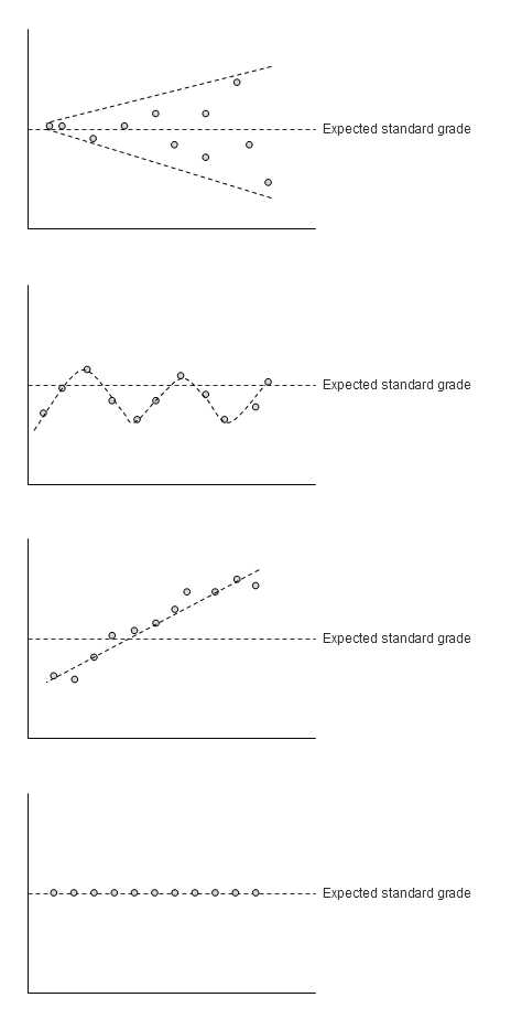
Non random patterns
We expect to see random fluctuations about the expected standard grade. Any discernable patterns should be a warning to interrogate the batch of data further. Patterns include:
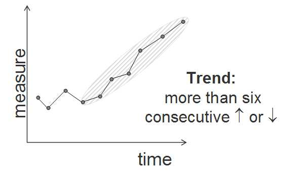
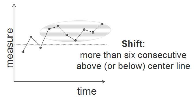
· Consistently higher (or lower) grades than expected
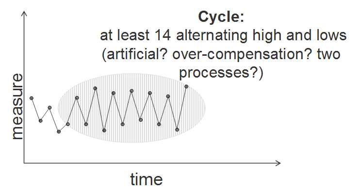
· Cyclical increasing and decreasing grades
· Increasing (or decreasing) variability in the standard values
· Grades trending up (or down) or
· Standards returning identical values
Setting control limits
Control limits provide a warning that the laboratory is returning standard grades that are out of bounds of the natural variability expected in the standard data. Useful control limits2 are typically 10% either side of the expected standard grade. Laboratory supplied standard values outside this range are a warning to check the batch of data provided by the laboratory.


Warning signals used within Minitab software’s control charts include:
· One point more than three standard deviations from the centre line
· Nine points in a row on same side of the centre line
· Six points in a row, all increasing or all decreasing
· Fourteen points in a row, alternating up and down
· Two out of three points more than two 2 standard deviations from the centre line (same side)
· Four out of five points more than one standard deviation from the centre line (same side)
· Fifteen points in a row within one standard deviation of the centre line (either side)
· Eight points in a row more than one standard deviation from the centre line (either side)
Activity
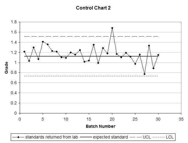
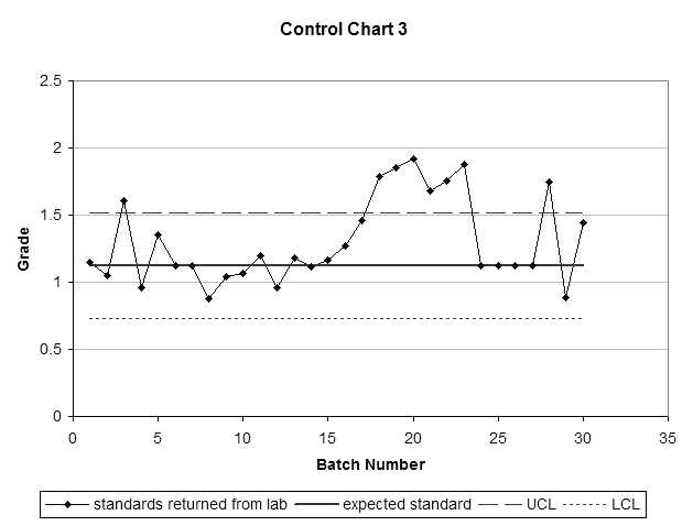
Assess the following three control charts. Are there any batches of samples you would question?